Tag: data analysis

  • Create an S Curve Pattern in Microsoft Excel A Comprehensive Guide

    Create an S Curve Pattern in Microsoft Excel A Comprehensive Guide

    Create an S Curve Pattern in Microsoft Excel sets the stage for mastering data analysis techniques. This comprehensive guide dives deep into creating, interpreting, and visualizing S-curves using Microsoft Excel. We’ll explore the intricacies of data preparation, the selection of appropriate modeling methods, and the implementation of S-curve fitting in Excel. From understanding the core concepts to practical applications, this journey will equip you with the knowledge and tools to confidently tackle S-curve analysis in various fields.

    The guide will cover the different types of S-curves, including logistic and Gompertz models, and discuss their respective advantages and disadvantages. It will also delve into the crucial aspects of data preparation, emphasizing the importance of data cleaning and validation. Visualizing these curves in Excel, creating compelling charts and graphs, and understanding the elements for effective visualization will be central themes.

    Introduction to S-Curve Patterns: Create An S Curve Pattern In Microsoft Excel

    An S-curve pattern, a common graphical representation in various fields, depicts a gradual increase in a quantity over time, initially slow, then accelerating, and finally leveling off. It’s a powerful tool for understanding trends and anticipating future performance. The shape mirrors the natural growth cycles often observed in technological advancements, market penetration, and project timelines.This pattern is characterized by its distinct phases, reflecting different stages of development or implementation.

    Understanding the characteristics of each phase allows for better planning, resource allocation, and risk management. S-curve analysis provides valuable insights into the potential for future growth and the associated challenges. It’s widely applicable across numerous industries, from project management to sales forecasting.

    Typical Characteristics of an S-Curve

    The S-curve’s characteristic shape is derived from the interplay of several factors. It starts with a slow, gradual increase, often representing the initial phase of development or implementation where resources are being allocated and infrastructure built. This phase is followed by a period of accelerating growth, where the momentum increases and significant progress is made. Finally, the growth rate slows and plateaus, reaching a maximum capacity or saturation point.

    The shape itself resembles the letter ‘S’ on a graph.

    Practical Applications of S-Curve Analysis

    S-curve analysis is a valuable tool in diverse fields. In project management, it helps visualize project progress, anticipate potential delays, and adjust resource allocation as needed. By plotting the project’s actual progress against the predicted S-curve, deviations can be identified early on, enabling proactive adjustments. In sales forecasting, it allows businesses to predict future sales revenue based on historical data and market trends.

    The predicted S-curve helps in setting realistic targets and anticipating periods of rapid growth or slower progress. In technology adoption, it can predict how quickly a new product or service will gain market share.

    Stages of an S-Curve and Potential Issues

    Understanding the different stages of an S-curve and the associated potential issues is crucial for effective management and planning.

    Stage of the S-curve Typical Characteristics Potential Issues
    Initial Stage (Slow Growth) Low output, investment in infrastructure, learning curve, and development. Insufficient resources, delays, low motivation, and lack of clear direction.
    Accelerating Stage (Rapid Growth) Increased output, high efficiency, and significant progress. Demand outpacing supply, insufficient skilled workforce, and potential quality issues.
    Maturing Stage (Decelerating Growth) Output growth slows, approaching saturation, and efficiency stabilizes. Stagnation, decreased motivation, difficulty in sustaining growth, and need for innovation.
    Plateau Stage (Saturation) Output stabilizes at a maximum capacity. Maintaining market share, adapting to changing market conditions, and identifying new growth opportunities.

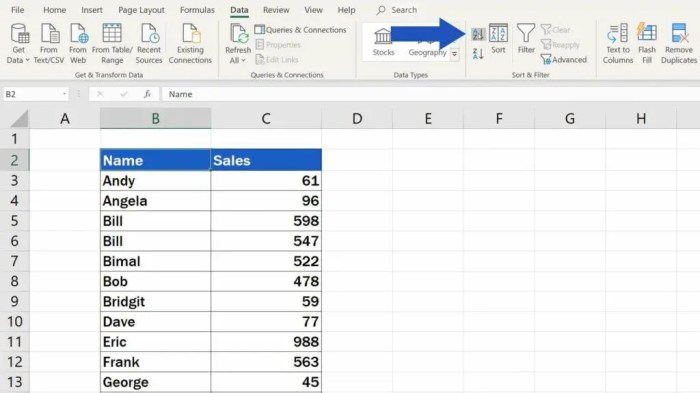
    Data Preparation for S-Curve Creation

    Preparing your data meticulously is crucial for accurately fitting an S-curve. A poorly prepared dataset can lead to an inaccurate model, misinterpretations, and ultimately, flawed predictions. This section details the essential steps for data cleaning, validation, and handling missing data and outliers to ensure your S-curve model is reliable and robust.

    Creating an S curve pattern in Excel can be a useful tool for visualizing growth, and I’ve been experimenting with it lately. It’s fascinating how these patterns emerge from data, and it’s a great way to represent trends. For example, if you were analyzing a music festival like the lollapalooza report saturday joshua klein , you might use an S curve to chart the attendance throughout the day.

    Ultimately, understanding how to craft these curves in Excel allows for a deeper insight into the data itself.

    Data Cleaning and Validation

    Thorough data cleaning and validation are essential steps in the process. Errors in the data can significantly skew the results of the S-curve fitting process. Inconsistencies, inaccuracies, or irrelevant data points can distort the shape of the curve and produce unreliable predictions. Identifying and addressing these issues upfront ensures the model’s accuracy and reliability.

    • Data Inspection: Carefully examine the data for any inconsistencies, errors, or outliers. This initial review helps identify patterns and potential problems. Look for discrepancies in units, formatting, or illogical values that might need correction.
    • Data Validation Rules: Establish clear rules for validating the data. This involves defining acceptable ranges, formats, and types of values for each data point. For example, if the data represents sales figures, ensure values are positive numbers. Defining these rules helps catch errors and inconsistencies early in the process.
    • Data Transformation: If needed, transform the data to a suitable format for S-curve fitting. This might involve converting units, scaling values, or applying mathematical functions to align with the expected model input.

    Handling Missing Data Points

    Missing data points are a common issue in datasets. These gaps can significantly affect the accuracy of the S-curve model. Appropriate strategies for handling missing values are necessary to ensure the model’s reliability.

    • Identifying Missing Data: First, identify which data points are missing. Use Excel’s built-in tools or custom formulas to locate these gaps in the dataset. This will allow you to implement a suitable strategy.
    • Imputation Techniques: Several imputation techniques can be used to fill in missing data points. For example, you can use the mean, median, or mode of the existing data to estimate the missing values. More sophisticated methods, like regression imputation, can also be considered for more complex datasets.
    • Removal of Data Points: In certain cases, removing the data points with missing values might be the best approach. This strategy is usually only recommended if the proportion of missing data is relatively small and doesn’t significantly impact the overall dataset.

    Handling Outliers

    Outliers are extreme values that deviate significantly from the majority of the data points. These outliers can skew the results of the S-curve fitting process. It’s crucial to identify and address outliers appropriately.

    • Identifying Outliers: Use visual methods like scatter plots or box plots to identify potential outliers. Statistical methods like calculating the interquartile range (IQR) can also help pinpoint extreme values.
    • Investigating Outliers: Once identified, investigate the reasons behind the outliers. They might be genuine data points or errors in data entry. Understanding the source of the outliers helps determine the best course of action.
    • Handling Outliers: Strategies for handling outliers include removing them, transforming the data to reduce their impact, or using robust statistical methods that are less sensitive to extreme values.

    Data Preparation Steps

    Step Description Tools/Techniques
    1 Inspect the data for inconsistencies, errors, and outliers. Visual inspection, data profiling tools
    2 Establish data validation rules. Excel formulas, data validation features
    3 Transform the data if necessary. Excel formulas, data transformation functions
    4 Identify and handle missing data points. Excel formulas, imputation techniques (mean, median, mode, regression)
    5 Identify and handle outliers. Visualizations (scatter plots, box plots), statistical methods (IQR), data transformation

    Selecting Suitable Methods for S-Curve Modeling

    Crafting an S-curve in Excel involves choosing the right modeling technique. The best approach depends on the nature of your data and the desired level of accuracy. This section delves into various methods, highlighting their strengths and weaknesses to aid your decision-making process.

    Methods for S-Curve Creation

    Different techniques can be employed to construct S-curves in Excel. These range from simple trendline fitting to more complex custom functions or specialized add-ins. Understanding the characteristics of each method is crucial for selecting the most appropriate one for your specific data.

    Trendlines

    Trendlines are a straightforward and readily available tool within Excel. They offer a visual representation of data trends, which can be helpful for approximating an S-curve. However, their inherent limitations in capturing the nuanced shape of an S-curve should be considered.

    • Advantages: Ease of use, readily available within Excel, provides a visual representation of data trends.
    • Disadvantages: May not accurately capture the inflection points and asymptotic behavior characteristic of S-curves, especially for complex data sets. Requires careful selection of the appropriate trendline type.
    • Suitability: Suitable for relatively simple data sets where a general trend approximation is sufficient. Not ideal for highly complex or precise S-curve modeling.

    Custom Functions

    Custom functions allow for greater flexibility in defining the shape of the S-curve. These functions can be tailored to specific data characteristics, potentially leading to a more accurate representation. Developing these functions, however, requires a deeper understanding of mathematical modeling and programming in Excel.

    • Advantages: High degree of customization, potentially greater accuracy, allows for incorporation of specific data characteristics.
    • Disadvantages: Requires programming knowledge and careful function design. May be computationally intensive, particularly for complex functions. Potential for errors in the function definition leading to inaccurate results.
    • Suitability: Suitable for complex data sets where trendlines are insufficient. Best employed when a strong understanding of the underlying mathematical principles driving the S-curve is available.

    Specialized Add-ins

    Specialized Excel add-ins offer pre-built tools for creating and analyzing S-curves. These often include sophisticated algorithms and statistical methods, potentially leading to higher accuracy and ease of use. The availability and suitability of these add-ins depend on the specific software package used.

    • Advantages: Often include advanced algorithms and statistical methods, potentially increasing accuracy, streamlined workflow, and user-friendly interfaces.
    • Disadvantages: Cost or licensing requirements, potential incompatibility with other software, may require additional learning curves for the specific add-in. Not all add-ins may perfectly fit all datasets.
    • Suitability: Suitable for cases where high accuracy and efficiency are paramount, or when a large number of S-curves need to be generated. Ideal for users with advanced technical skills who require specialized features.

    Comparison Table

    Method Advantages Disadvantages Suitability
    Trendlines Ease of use, visual representation Limited accuracy, may not capture inflection points Simple data sets, general trend approximation
    Custom Functions High customization, potentially greater accuracy Requires programming knowledge, computational intensity Complex data sets, strong understanding of S-curve
    Specialized Add-ins Advanced algorithms, streamlined workflow Cost/licensing, potential incompatibility, learning curve High accuracy required, numerous S-curves needed

    Implementing S-Curve Modeling in Excel

    Create an S Curve Pattern in Microsoft Excel

    S-curve modeling is a powerful technique for analyzing and predicting growth patterns. Understanding how to implement these models in Excel allows for the visualization and interpretation of data in a meaningful way. This section dives into the practical application of S-curve fitting within Microsoft Excel, providing detailed steps and examples.Excel’s built-in tools provide a straightforward approach to fitting S-curves to your data.

    These tools, combined with a solid understanding of the underlying models, empower you to extract valuable insights from your data.

    Using Excel’s Trendline Feature

    Excel’s trendline feature simplifies the process of creating S-curve models. This feature allows for the visual representation of the data’s trend and the fitting of various types of curves, including S-curves. Different types of S-curves are better suited to different types of data.

    To create a trendline in Excel, select the data points on the chart, right-click, and choose “Add Trendline.” From the “Trendline Options” dialog box, select the desired S-curve type. This dialog box usually offers various options like exponential, logarithmic, polynomial, moving average, and more.

    Polynomial Fitting for S-Curves

    Polynomial fitting is a versatile method for modeling S-curves. It involves using a polynomial function to approximate the relationship between variables in the dataset. This method can effectively capture various growth patterns, though it may require careful consideration of the degree of the polynomial to avoid overfitting.A higher-degree polynomial can fit the data more closely, but may not accurately reflect the underlying trend.

    Figuring out how to create an S curve pattern in Excel can be tricky, but it’s a useful skill for visualizing trends. While I was researching different methods, I stumbled upon some exciting news about turnstile announce the never enough tour here. Getting that S curve just right in your spreadsheet is rewarding, especially when you’re analyzing data and trying to understand its direction.

    The best degree is determined by evaluating the model’s performance.

    Different Types of S-Curves

    Various mathematical models describe S-curve patterns. Each model has unique characteristics and is suitable for specific data scenarios.

    • Logistic Curve: This model is characterized by an initial slow growth rate, followed by an accelerated growth phase and finally, a deceleration as it approaches saturation. It is commonly used to model population growth or market penetration.
    • Gompertz Curve: This model also depicts an S-shaped growth pattern. However, it’s characterized by a more pronounced initial lag phase and a faster deceleration compared to the logistic curve. It is often used to model biological growth processes.

    Formulas Behind S-Curve Models

    The mathematical equations underpinning S-curve models determine their behavior. These formulas dictate the shape and characteristics of the curve.

    • Logistic Function: y = L / (1 + e (-k(x – x0)) ), where L is the maximum value, k is the growth rate, and x 0 is the x-value at the midpoint of the curve.
    • Gompertz Function: y = L
      – e (-e(-k(x – x0)) ) , where L is the maximum value, k is the growth rate, and x 0 is the x-value at the midpoint of the curve.

    Step-by-Step Procedure for Fitting an S-Curve (Example: Logistic Curve)

    This example Artikels fitting a logistic curve using Excel’s trendline feature.

    1. Data Preparation: Ensure your data is organized with x-values (independent variable) in one column and y-values (dependent variable) in another.
    2. Create a Scatter Plot: In Excel, create a scatter plot with your data points.
    3. Add Trendline: Right-click on the data points, select “Add Trendline,” and choose “More Options.” In the “Trendline Options” dialog box, select “Logistic” from the “Trendline type” dropdown menu.
    4. Display Equation: Ensure the “Display Equation on chart” option is checked.
    5. Display R-squared: Check the “Display R-squared value on chart” option for assessing goodness of fit.
    6. Analyze Results: Interpret the equation and R-squared value to understand the fitted curve and its accuracy.

    Interpreting and Analyzing the S-Curve

    The S-curve, a graphical representation of cumulative progress over time, reveals valuable insights into project performance and forecasting. Understanding its parameters and inflection points is crucial for effective project management and strategic decision-making. This analysis extends beyond simple visual interpretation to incorporate statistical methods for assessing the accuracy of the model and its predictions.Interpreting the S-curve involves examining the shape, identifying key points, and analyzing the underlying data to derive meaningful conclusions.

    The parameters of the model, combined with the visual representation, offer a powerful tool for forecasting and trend identification. The analysis extends to the identification of error sources and the evaluation of the model’s accuracy to ensure reliable predictions.

    Interpreting Model Parameters

    Model parameters are essential for understanding the S-curve’s characteristics. These parameters dictate the curve’s shape, growth rate, and eventual saturation point. Different mathematical models generate various parameters. For example, the logistic function often yields parameters such as the growth rate, initial value, and carrying capacity. Careful analysis of these parameters provides insight into the factors driving the observed pattern.

    Forecasting Future Values

    The S-curve can be used to forecast future values or trends by extrapolating the observed pattern. By fitting a suitable model to historical data, the curve can project future performance. For instance, in software development, an S-curve representing cumulative features implemented over time can be used to forecast the completion date of a project based on the model’s predictions.

    However, it’s important to acknowledge that forecasting relies on the model’s accuracy and the validity of its assumptions.

    Identifying Inflection Points

    Inflection points, where the curve changes its concavity, are significant turning points on the S-curve. These points often indicate shifts in the underlying process or project dynamics. For instance, a rapid increase in the S-curve’s slope might signal the introduction of new resources or a change in strategy. Recognizing these shifts is crucial for adjusting project plans and strategies accordingly.

    Importance of Error Analysis

    Error analysis is vital in evaluating the accuracy of the S-curve model. Calculating the difference between the predicted values and the actual data points reveals potential sources of error. This analysis can help identify model shortcomings or data anomalies. Statistical measures like the coefficient of determination (R-squared) and root mean squared error (RMSE) are used to quantify the model’s fit and identify potential areas for improvement.

    Figuring out how to create an S curve pattern in Excel can be tricky, but it’s definitely doable. While exploring the visual intricacies of this pattern, I stumbled upon some amazing photos of Erykah Badu and Janelle Monáe, showcasing their unique styles photos erykah badu janelle monae. Getting back to the task at hand, the key to creating a smooth S curve in Excel lies in understanding the data points and using the right charting tools.

    It’s a satisfying process, and hopefully these tips help you tackle your own Excel S curves.

    Assessing Goodness of Fit

    Assessing the goodness of fit of the S-curve to the data is crucial for determining its reliability. Various statistical measures, like R-squared, are used to quantify the proportion of variance in the data explained by the model. A high R-squared value indicates a good fit, while a low value suggests the model may not accurately represent the underlying trend.

    Visual Representation Elements

    A clear visual representation of an S-curve should include several key elements. These include properly labeled axes (time on the x-axis and cumulative value on the y-axis), a clear plot of the data points, and the fitted S-curve overlaid on the data. The visual representation should also include any relevant annotations, such as inflection points, trend lines, and error bars.

    A well-structured visualization allows for quick comprehension of the project’s progress and future projections. Color-coding data points based on categories (e.g., different phases of a project) can further enhance the visualization.

    Case Studies and Practical Examples

    S-curves aren’t just theoretical constructs; they’re powerful tools for understanding and predicting growth patterns in various industries. This section dives into real-world applications, showcasing how S-curves can provide actionable insights. We’ll explore the data sources used, analyze results, and demonstrate a practical step-by-step approach for implementing this method on your own data.Understanding how S-curves manifest in diverse industries allows for more informed decision-making.

    Analyzing successful implementations reveals patterns and best practices, offering a roadmap for your own S-curve analyses.

    Real-World S-Curve Applications, Create an S Curve Pattern in Microsoft Excel

    Various sectors leverage S-curves to track progress and anticipate future trends. Examples include market penetration of new technologies, product adoption rates, and the scaling of production processes. A crucial aspect is recognizing that the specific shape and inflection points of an S-curve vary greatly depending on the industry and the factors influencing it.

    • Technology Adoption: The adoption of smartphones, initially slow, rapidly increased after overcoming initial hurdles like price and infrastructure limitations. Data sources for this analysis would include market share reports from companies like IDC and Gartner, alongside sales data from manufacturers and carriers. Analysis reveals a clear S-curve pattern, with rapid growth occurring after a period of slower initial uptake.

      This illustrates how technology adoption often follows an S-curve, highlighting the critical factors contributing to the inflection point.

    • Manufacturing Production: A company ramping up production for a new product line might experience an S-curve pattern. The data sources for this analysis would include production output data, material procurement data, and labor hour statistics. Analysis reveals how initial difficulties in scaling production, like equipment setup or workforce training, create a slower start. The S-curve model can be used to identify bottlenecks and adjust strategies to accelerate production growth and optimize the use of resources.

    • Market Penetration of a New Drug: A new drug’s market penetration might follow an S-curve pattern. Data sources would include sales figures, regulatory approvals, and clinical trial results. Analysis would show the drug’s gradual adoption, accelerating once it gains approval and positive clinical feedback. The S-curve analysis can aid in understanding the time it takes for the drug to reach maximum market penetration and what factors might affect this.

    Data Sources for S-Curve Analysis

    The data utilized for S-curve modeling is crucial for the accuracy of the results. The specific data needed will depend on the specific application, but common data types include:

    • Sales figures: Monthly or quarterly sales data provide insights into market penetration and growth.
    • Production output: Track the rate at which products are being manufactured over time. This data is important for identifying scaling limitations and bottlenecks.
    • Market share: The percentage of the total market that a company controls, or a product occupies, provides insights into relative growth.
    • Customer adoption rates: Data on the number of customers adopting a new product or service, gathered over time, provides insights into the rate of uptake.
    • Financial reports: Company financial data can reflect revenue and growth patterns over time.

    Step-by-Step Guide: Applying S-Curve Method to a Dataset

    This guide Artikels a general approach for implementing the S-curve method to a dataset, using sales data as an example.

    1. Data Collection and Preparation: Gather relevant sales data over time (e.g., monthly sales figures). Clean and prepare the data by handling missing values or outliers.
    2. Visual Representation: Plot the sales data against time. Visualizing the data in this way allows for a quick assessment of the overall trend and potential S-curve pattern.
    3. Model Selection: Choose a suitable S-curve model based on the visual inspection and the characteristics of the dataset. Various mathematical functions can be used, such as logistic or Gompertz functions. The chosen function should best fit the observed trend.
    4. Parameter Estimation: Use statistical methods or software to estimate the parameters of the chosen S-curve model. These parameters determine the shape and position of the curve.
    5. Interpretation of Results: Analyze the fitted S-curve. Identify inflection points, saturation points, and growth rates. This analysis provides valuable insights into the trajectory of sales and potential future outcomes.

    Interpreting Insights from the S-Curve

    Interpreting insights from an S-curve involves understanding the factors contributing to the curve’s shape.

    • Inflection Point: The inflection point indicates the point of maximum growth rate. This is a crucial point for strategizing marketing and production efforts.
    • Saturation Point: The saturation point represents the limit of growth for the product or service. Analyzing the factors behind the saturation point can lead to new opportunities or strategic pivots.
    • Growth Rate: The rate of growth can be analyzed to determine if the current strategy is effective or if adjustments are needed to maintain momentum.

    Final Summary

    Create an S Curve Pattern in Microsoft Excel

    In conclusion, this comprehensive guide to creating S-curve patterns in Microsoft Excel empowers you to analyze data effectively and extract valuable insights. We’ve covered the entire process, from initial data preparation to final visualization. Whether you’re a project manager, sales analyst, or researcher, understanding S-curves can significantly enhance your ability to forecast trends, identify critical points, and make data-driven decisions.

    The practical examples and step-by-step instructions will make this a truly actionable guide.

  • Alphabetize Cells in Excel Your Data, Sorted

    Alphabetize Cells in Excel Your Data, Sorted

    Alphabetize Cells in Excel is a fundamental skill for anyone working with spreadsheets. This guide dives deep into organizing your data, from basic sorting techniques to advanced methods for handling diverse data types. Understanding how to alphabetize effectively will transform how you manage, analyze, and present information in your Excel spreadsheets.

    We’ll explore various methods for alphabetizing, from simple column sorts to more complex scenarios involving formulas and conditional formatting. Whether you’re dealing with names, numbers, dates, or a mix of data types, this comprehensive guide will equip you with the tools to master data organization in Excel.

    Introduction to Cell Alphabetization in Excel: Alphabetize Cells In Excel

    Alphabetizing cells in Excel is a straightforward yet powerful technique for organizing data. It involves arranging data in alphabetical order, primarily for text-based information, making it easier to locate specific entries and identify patterns. This method is especially useful when dealing with large datasets where manual searching is time-consuming and error-prone.This process enhances data readability and facilitates more efficient analysis.

    Proper organization is crucial for effective data manipulation, analysis, and presentation in Excel.

    Ever needed to alphabetize cells in Excel? It’s a surprisingly handy task, especially when you’re dealing with a large dataset. While sorting is straightforward, alphabetizing can be a bit more involved. Luckily, there are plenty of tutorials online. Speaking of things that are surprisingly involved, I just finished watching a fantastic set by Four Tets, their hour-long SXSW Boiler Room performance is absolutely worth checking out.

    watch four tets hour long sxsw boiler room set Once you’ve got that sorted, you’ll be back to efficiently alphabetizing those Excel cells with ease.

    Scenarios for Alphabetization

    Alphabetizing cells in Excel becomes highly beneficial in a variety of situations. For instance, it’s indispensable for managing lists of names, product catalogs, or customer databases. It aids in quickly finding specific information within a large dataset, like locating a specific product in a product catalog. The simplicity of alphabetical order significantly reduces the time spent searching for information.

    Importance of Data Organization in Excel

    Organized data in Excel spreadsheets is essential for effective analysis and decision-making. A well-structured spreadsheet allows users to easily identify trends, patterns, and insights within the data. Unorganized data can lead to wasted time and inaccurate conclusions. Clean, sorted data makes extracting relevant information a straightforward process, minimizing errors and improving the efficiency of data analysis.

    Preparing Data for Alphabetization

    Before alphabetizing, ensure the cells containing the data to be sorted are in a consistent format. Ensure all data entries are in the same column, and all data is text-based for proper alphabetization. Removing any irrelevant or extraneous data from the spreadsheet is vital. A clean and structured dataset is crucial for successful alphabetization. Avoid having mixed data types in the column being sorted, for example, a mix of numbers and text.

    Examples of Datasets Benefiting from Alphabetization, Alphabetize Cells in Excel

    Various datasets can greatly benefit from alphabetization. Customer lists, product inventories, and contact lists are prime examples. Imagine a large customer database; alphabetizing the customer names would allow for quick identification and efficient searching. Similarly, in a product catalog, alphabetizing product names would allow for rapid lookup.

    Basic Excel Spreadsheet Example

    This example demonstrates a scenario where alphabetization is beneficial. The spreadsheet contains a list of products.

    Product Name
    Keyboard
    Mouse
    Monitor
    Laptop
    Webcam
    Headphones

    Alphabetizing the “Product Name” column would yield the following:

    Product Name
    Headphones
    Keyboard
    Laptop
    Monitor
    Mouse
    Webcam

    This organized format simplifies locating a particular product, enabling quicker access to relevant information.

    Methods for Alphabetizing Cells

    Mastering Excel’s alphabetization capabilities unlocks powerful data organization. Whether you’re sorting a simple list or a complex spreadsheet, understanding the various methods available can significantly streamline your workflow. Efficient sorting ensures accurate analysis and insightful reporting.Excel offers several avenues for alphabetizing data. From straightforward built-in functions to more intricate custom solutions, this exploration dives into the practical applications of each technique, guiding you towards the optimal approach for your specific needs.

    Choosing the right method is crucial for performance and accuracy in your data manipulation.

    Built-in Excel Sorting Functions

    Excel’s built-in sorting functions provide a straightforward and efficient way to alphabetize data. These functions are integrated directly into the software, eliminating the need for external add-ins or complicated coding. Their user-friendly interface makes them accessible to all skill levels.

    • Using the “Sort” Feature: This feature, found in the “Data” tab, allows you to sort data in ascending or descending order by one or multiple columns. The “Sort” function is an integral part of Excel’s data manipulation tools, offering a quick and easy way to organize data. Its intuitive interface makes it readily usable for users of all experience levels.

    • Utilizing the SORT Function: The SORT function, introduced in recent Excel versions, offers a more dynamic and flexible approach to sorting. This function allows for sorting by multiple columns, specifying custom order, and handling different data types more effectively. This built-in function is an extremely useful tool for manipulating data within spreadsheets, especially when dealing with complex or large datasets.

    Alphabetizing by Column

    Sorting data by a single column is a fundamental task in Excel. This process involves arranging the data in ascending or descending order based on the values within a particular column. This method is widely used for simple organization and preliminary data analysis.

    Sorting those Excel cells alphabetically is surprisingly useful, like alphabetizing your to-do list. Sometimes, though, a good excuse is needed to skip class, and for that, you can check out some creative options at Excuses to Miss Class. Once you’ve got your Excel data in order, you can quickly find the specific information you need, just like you can find the perfect excuse to skip that boring lecture!

    Step Description Screenshot (Conceptual – Replace with your own)
    1 Select the data range you want to sort. This includes the header row, if applicable. (Image: A highlighted range of cells encompassing the header and data in a column.)
    2 Go to the “Data” tab in the Excel ribbon. (Image: The Excel ribbon with the “Data” tab selected.)
    3 Click on “Sort”. (Image: The “Sort” button within the “Data” tab.)
    4 Choose the column by which you want to sort. Select the header of the column from the drop-down menu. (Image: A dialog box for sorting, showing the column selection option.)
    5 Choose the sort order (ascending or descending). Click “OK”. (Image: A dialog box for sorting, showing the ascending/descending option selection.)

    Sorting by Multiple Columns

    Excel allows you to sort data based on multiple columns, creating a more sophisticated organization method. This process prioritizes the order of columns when sorting. For example, you might sort first by date, then by name.

    • Prioritizing Columns: The first chosen column dictates the primary sort order. Subsequent columns refine the sort based on their values within the rows already ordered by the first column.
    • Illustrative Example: If you sort by date and then by name, rows with the same date will be further ordered alphabetically by name. This approach allows for detailed and layered organization within the data.

    Comparison of Sorting Methods

    The “Sort” feature provides a quick and simple method for single-column sorts. The SORT function offers more flexibility, allowing for dynamic sorting, including custom orders and handling of different data types. The efficiency depends on the complexity of the data and the specific needs of the task. For most basic sorting tasks, the “Sort” feature is efficient enough.

    However, the SORT function becomes more valuable when dealing with larger datasets or more complex sorting criteria.

    Limitations of Alphabetization Methods

    While these methods are powerful, limitations exist. For instance, the “Sort” feature might not handle complex data types or nested data structures efficiently. Additionally, custom sorting rules or criteria might require more complex formulas or VBA scripts.

    Handling Specific Data Types

    Alphabetize Cells in Excel

    Excel’s alphabetization capabilities extend beyond simple text. Understanding how different data types are treated is crucial for accurate sorting. This section delves into the nuances of alphabetizing various data types, from numbers and dates to text with special characters.Excel’s sorting algorithm recognizes different data types and applies specific rules to maintain order. This ensures that numbers are sorted numerically, dates chronologically, and text alphabetically.

    This understanding is vital for producing reliable and meaningful results from alphabetization.

    Alphabetizing Text Data

    Text data is alphabetized based on the standard alphabetical order of characters. This means that upper-case letters come before lower-case letters, and special characters are sorted according to their position in the character set. For example, “apple” would appear before “Banana” and “10 apples” would come after “9 apples.”

    Alphabetizing Numerical Data

    Numbers are sorted numerically, from smallest to largest. Excel handles whole numbers, decimals, and even negative numbers correctly. For instance, -10 will appear before 0, and 2.5 will be sorted after 2. This straightforward numerical order is crucial for sorting financial data or any dataset containing numerical values.

    Alphabetizing Date Data

    Dates are sorted chronologically, from earliest to latest. Excel recognizes different date formats and converts them internally for consistent sorting. For example, dates in MM/DD/YYYY format will be sorted before dates in DD/MM/YYYY format, assuming the year is the same. This chronological order is essential for tasks involving time-series data.

    Ever wrestled with alphabetizing cells in Excel? It’s a surprisingly common task, and a surprisingly powerful one, especially when you’re working with large datasets. To help you master this Excel skill, consider checking out the announcing total control live stream with vivid live for a helpful demonstration of similar data organization techniques, which can translate directly to sorting and alphabetizing your spreadsheets.

    This will streamline your workflow and make data analysis significantly easier in your Excel projects.

    Alphabetizing Mixed Data Types

    When a column contains a mix of data types, Excel applies the default sorting order to each type. For instance, a column with numbers, dates, and text will first sort numbers, then dates, and finally text. This approach can be customized using advanced sorting options if needed.

    Handling Special Characters and Symbols

    Special characters and symbols are also considered during alphabetization, following the standard character set order. For example, a column with names including accented characters will sort according to the character’s position in the character set. Understanding this behavior is vital for handling data from various sources.

    Significance of Data Type Recognition

    Data type recognition in sorting is paramount for obtaining accurate results. Sorting numbers as text will produce incorrect orderings, and similarly, dates sorted as text will yield unexpected results. The correct identification of data types guarantees reliable and meaningful results, particularly for large datasets.

    Sorting Order Table

    Data Type Sorting Order Example
    Text Alphabetical (case-sensitive) apple, banana, cat
    Number Numerical (smallest to largest) 1, 2, 10, 20
    Date Chronological (earliest to latest) 1/1/2023, 1/15/2023, 2/1/2023

    Advanced Alphabetization Techniques

    Excel’s alphabetization capabilities extend beyond simple sorting. Advanced techniques allow for more nuanced control over the process, enabling users to sort data based on custom criteria, handle complex data types, and streamline the alphabetization process for various scenarios. This section delves into these advanced methods, providing practical examples and step-by-step instructions.

    Alphabetizing with Formulas and Conditional Formatting

    Formulas and conditional formatting can enhance alphabetization by applying customized logic. These methods allow for sorting data based on specific criteria not directly available in the data itself. Conditional formatting can highlight sorted items, while formulas can create a secondary, sorted column for easier manipulation.

    • Formulas for Sorting: Instead of relying on Excel’s built-in sort functions, formulas can create a helper column containing the sorting criteria. For example, if you want to alphabetize names based on the last name first, a formula can extract the last name from the full name and use this extracted data for sorting. This allows for sorting based on complex rules, like sorting names with titles (e.g., Dr.

      Smith, Mr. Jones). The formula might be: =RIGHT(A2,LEN(A2)-FIND(" ",A2)). This formula extracts the text after the space, effectively getting the last name from a full name in cell A2.

    • Conditional Formatting for Visualization: Once data is sorted, conditional formatting can highlight the sorted items. This visually emphasizes the sorted data and aids in identifying specific values within a large dataset. For instance, sorted items could be highlighted in a different color to distinguish them from the unsorted data. This is useful for large spreadsheets and enhances readability.

    Custom Criteria Sorting

    Excel’s built-in sorting options allow sorting by multiple columns. This can be extended further by establishing custom criteria, enabling advanced sorting beyond simple alphabetical order. For instance, you might want to sort products by category and then by price within each category.

    • Custom Sort Orders: Excel allows defining a custom sort order. For example, if you have a column of product categories with a specific order (e.g., Electronics, Clothing, Home Goods), you can specify this order for sorting, ensuring that Electronics appears before Clothing and Clothing before Home Goods in the sorted list. This custom sort order is a valuable tool for non-alphabetical sorting.

    Using Helper Columns

    Helper columns are crucial for alphabetizing data that doesn’t readily fit into a simple sort. They provide a temporary column to facilitate the alphabetization process.

    • Extracting Data for Sorting: A helper column can extract relevant parts of a cell’s content for sorting. For example, if you have a column of dates in a non-standard format (e.g., “2023-10-26”), a helper column can extract the year to facilitate sorting by year. This allows for more granular control over the alphabetization process.
    • Data Transformation: Helper columns are also invaluable for transforming data before sorting. Suppose your data includes a mixture of uppercase and lowercase text. A helper column can convert all text to lowercase, ensuring a consistent sort order. This allows you to alphabetize regardless of case sensitivity.

    Alphabetizing Filtered or Specific Range Data

    Sorting filtered or specific data ranges allows for targeted alphabetization. This is particularly useful for handling large datasets where sorting the entire sheet is inefficient.

    • Sorting Filtered Data: Excel allows sorting the visible rows after filtering data. This is crucial for maintaining a specific filter while alphabetizing only the rows that meet the filtering criteria. This avoids sorting the entire dataset and improves performance with large spreadsheets.
    • Sorting Specific Ranges: Sorting a specific range allows for selective alphabetization within a dataset. This is often useful for isolating and sorting data within a section of a larger spreadsheet, like sorting a subset of sales figures.

    Alphabetizing by Cell Content or Formatting

    Beyond simple text, you can alphabetize cells based on their content or formatting. This adds further flexibility to the alphabetization process.

    • Sorting by Cell Formatting: While Excel primarily sorts by cell content, some conditional formatting can affect sorting. For instance, if you have cells formatted in bold, these might be sorted to the top or bottom depending on the sort settings.
    • Sorting Based on Cell Values: You can alphabetize based on specific parts of the cell content, such as sorting a column of dates by year or month.

    Sorting with Formulas or Conditional Formatting

    This table Artikels the steps involved in sorting data using formulas or conditional formatting.

    Step Action
    1 Identify the column(s) or criteria for sorting.
    2 Create a helper column (if necessary) using formulas to extract or transform data for sorting.
    3 Select the data range including the helper column (if applicable).
    4 Use Excel’s Sort function, specifying the helper column(s) or criteria for sorting.
    5 (Optional) Apply conditional formatting to highlight sorted items.

    Troubleshooting Common Issues

    Alphabetizing cells in Excel, while seemingly straightforward, can sometimes present unexpected hurdles. Understanding potential pitfalls and their solutions is crucial for achieving accurate and reliable results. This section delves into common problems encountered during alphabetization, examining data-related issues, Excel version discrepancies, and techniques for resolving errors.Data discrepancies and formatting inconsistencies can significantly impact the alphabetization process. Inconsistent capitalization, extra spaces, or non-standard characters can lead to unexpected sorting outcomes.

    Moreover, hidden characters or formatting differences (like different font styles) can disrupt the sorting order. Addressing these nuances is vital for obtaining accurate and dependable results.

    Common Data-Related Errors

    Data inconsistencies are frequent culprits behind alphabetization problems. Improper formatting or data entry errors can lead to unexpected sorting sequences. For example, if some entries are in all caps and others are mixed case, the sorting might not group them logically. Similarly, extra spaces or hidden characters within the data can disrupt the order.

    • Inconsistent Capitalization: Mixed case and all-caps entries will sort differently. For instance, “apple” will appear before “Apple” in an ascending sort. Ensure consistency in capitalization throughout the dataset to avoid unexpected results.
    • Extra Spaces: Leading or trailing spaces, or inconsistencies in the number of spaces between words, can cause incorrect ordering. ” Apple” and “Apple ” might not sort as expected, depending on the sorting method used.
    • Non-Standard Characters: Special characters or symbols in the data can interfere with the sorting process. Non-alphanumeric characters may be interpreted differently, disrupting the alphabetical order.
    • Hidden Characters: Unseen characters, often introduced during data import or copy-paste operations, can influence the sorting. These hidden characters can lead to entries being placed in unexpected locations in the sorted list.

    Excel Version Compatibility

    Different Excel versions might handle sorting differently, especially when dealing with complex data or specific formatting. Older versions may not always recognize the same data types or sorting options as newer versions. Compatibility issues can manifest in the inability to sort certain data types or inconsistencies in the sorting results. Always check your Excel version’s documentation for specific sorting limitations or guidelines.

    Resolving Sorting Errors

    Troubleshooting alphabetization errors requires a systematic approach. Identifying the source of the problem is crucial to implement an effective solution.

    • Duplicates: Excel often handles duplicates by placing them sequentially in the alphabetized list. If you need to remove duplicates, use the Remove Duplicates feature in Excel.
    • Inconsistent Formatting: Standardize data formatting. Use the Find & Replace feature to correct inconsistencies in capitalization, spaces, or other formatting issues.
    • Data Cleaning: Examine the data for hidden characters or formatting issues. Use the ‘Text to Columns’ feature to split data fields or clean up unwanted characters.
    • Custom Sorting: Consider creating custom sorting criteria if the standard alphabetical sort isn’t sufficient for your specific needs. This often involves creating a custom column or criteria for the sorting.

    Troubleshooting Table

    Error Description Solution
    Inconsistent Capitalization Mixed case and all-caps entries sort differently. Ensure consistent capitalization throughout the data.
    Extra Spaces Leading/trailing or inconsistent spacing. Use Find & Replace to remove extra spaces.
    Hidden Characters Unseen characters affect sorting. Use Text to Columns to clean the data.
    Excel Version Compatibility Different versions may sort differently. Consult the documentation for your Excel version.

    Real-World Applications

    Alphabetize Cells in Excel

    Alphabetizing cells in Excel transcends a simple data organization technique. It’s a fundamental step in transforming raw data into actionable insights across diverse industries. By arranging data alphabetically, you create a more structured and easily interpretable format, making it simpler to analyze trends, identify patterns, and ultimately, drive better decisions. This crucial process is not just a time-saver but a catalyst for effective data management and informed decision-making.Effective data organization is a cornerstone of successful data analysis.

    Alphabetized data allows for faster and more efficient searching, sorting, and filtering. This is particularly crucial in fields where a large volume of data needs to be reviewed quickly. Imagine sifting through thousands of customer records without a clear structure – alphabetization significantly streamlines this process, allowing for focused analysis and faster response times.

    Examples in Customer Relationship Management (CRM)

    Alphabetizing customer data in a CRM system significantly improves the efficiency of customer interactions and support. A well-organized list of customers, sorted alphabetically by name, allows agents to quickly locate specific accounts. This facilitates quicker resolution of customer issues, personalized support, and targeted marketing campaigns. For instance, if a company needs to send a promotional email to all customers with names starting with “A,” alphabetization makes this task incredibly efficient.

    Data Analysis and Reporting

    Alphabetized data empowers robust data analysis and insightful reporting. Imagine a marketing campaign with data on various customer segments. Alphabetizing the data by segment, for example, “New Customers,” “Repeat Customers,” and “High-Value Customers,” allows analysts to quickly identify trends and patterns within each segment. This streamlined approach enables the creation of more effective reports that highlight key insights, enabling strategic decisions related to product development, marketing strategies, and customer retention.

    Business Reports and Presentations

    In a business report or presentation, alphabetized data significantly enhances the clarity and impact of the findings. For example, in a report analyzing sales performance by product category, arranging product names alphabetically makes it easier for the audience to grasp the key performance indicators for each product. This clear and concise presentation facilitates a more effective communication of the report’s key takeaways.

    Example: Business Report on Sales Performance

    Imagine a company analyzing sales performance across different product categories. The raw data might be a jumbled mix of sales figures and product names. Alphabetizing the product names enables a structured approach to the analysis. For example, a report could be organized as follows:

    Product Name Sales (USD) Profit Margin (%)
    Accessories 12,500 25%
    Bags 15,000 20%
    Clothing 20,000 30%
    Electronics 10,000 15%
    Shoes 18,000 22%

    This structured format immediately highlights performance differences across product lines. Analysts can quickly identify the top-performing categories and areas needing improvement. This, in turn, aids in strategic decisions regarding product diversification, pricing strategies, and resource allocation.

    Conclusion

    In conclusion, mastering alphabetization in Excel empowers you to unlock the full potential of your spreadsheet data. By understanding the different sorting methods, handling various data types, and troubleshooting common issues, you can transform raw data into insightful information. This guide provides a solid foundation, but remember to adapt these techniques to your specific needs and data structures for optimal results.

  • Freeze Cells in Excel Mastering Spreadsheet Views

    Freeze Cells in Excel Mastering Spreadsheet Views

    Freeze Cells in Excel allows you to lock specific rows or columns in place, making your spreadsheets easier to read and navigate. Imagine working with a large dataset, scrolling through pages of information. Freezing key rows, like headers, lets you see them clearly while you explore the rest of the data. This tutorial delves into various techniques, from basic freezing to advanced methods, dynamic freezing, and even troubleshooting.

    Whether you’re analyzing financial data, managing projects, or just need to keep important headers visible while scrolling through extensive spreadsheets, mastering freezing cells in Excel is an essential skill. This comprehensive guide breaks down the process into easy-to-understand steps, from basic procedures to advanced techniques for dynamic and customized freezing. Learn how to tailor your spreadsheet layout for optimal viewing, and even how to troubleshoot any issues you might encounter.

    Introduction to Freezing Cells in Excel: Freeze Cells In Excel

    Freeze Cells in Excel

    Freezing panes in Excel allows you to keep specific rows and/or columns visible while scrolling through the rest of the worksheet. This is a crucial feature for maintaining context and preventing important information from disappearing as you navigate large datasets. It significantly improves the usability and efficiency of working with extensive spreadsheets.Freezing panes are extremely helpful for maintaining a clear overview of the data.

    They enable you to constantly reference key information, like column headers or row labels, while exploring the details of the worksheet.

    Freezing Panes: A Concise Definition

    Freezing panes in Microsoft Excel is a function that fixes specific rows and/or columns in place while scrolling. This allows users to retain the header row and column labels, making it easier to interpret and understand data across large datasets.

    Purpose and Benefits of Freezing Cells

    Freezing cells enhances user experience by preventing important data from being obscured during scrolling. This maintains a clear reference point, enabling users to readily identify and analyze data across the worksheet. This significantly improves the workflow and reduces the likelihood of errors when dealing with large datasets.

    Scenarios Where Freezing Cells is Useful

    Freezing panes are invaluable in a variety of scenarios, enhancing productivity and minimizing errors. Consider using it when analyzing data across multiple columns and rows, for instance, when reviewing sales data across various regions and time periods, or when monitoring project progress with detailed schedules and task assignments.

    Example Spreadsheet Demonstrating the Need for Freezing

    Imagine a spreadsheet tracking sales figures across different regions for the last quarter. Without freezing panes, scrolling through the data to compare regional performance might be difficult and confusing. Headers like “Region,” “Product,” “Sales,” and “Date” would disappear as you scroll, making it hard to maintain context. Freezing the header row, for instance, would solve this problem, allowing you to continuously see the labels.

    Table Illustrating Common Use Cases

    Use Case Frozen Rows Frozen Columns Benefit
    Analyzing sales data by region and product 1 (header row) 1 (region column) Allows comparison of sales across regions and products while retaining labels
    Tracking project progress 1 (header row) 1-2 (task and status columns) Maintains project overview while scrolling through tasks
    Financial reporting 1 (header row) 1-3 (account, description, and value columns) Allows quick access to financial details while viewing a large report
    Data analysis across multiple categories 1 (header row) Multiple (category columns) Provides a reference framework for analyzing data across categories

    Freezing rows and columns is a powerful tool that helps maintain data context and facilitates efficient data analysis in Excel. By freezing specific rows or columns, users can continuously view crucial information while navigating large datasets, which improves productivity and minimizes the risk of errors.

    Freezing Rows and Columns

    Freezing rows and columns in Excel is a powerful technique to maintain a consistent view of specific parts of a spreadsheet, especially when working with large datasets. This allows users to keep important headers or labels visible while scrolling through the data, enhancing usability and clarity. By freezing specific rows or columns, you effectively create a static reference point for your data, regardless of how far down or across you scroll.

    Freezing Specific Rows

    Freezing specific rows, like the header row containing column labels, ensures that those rows remain visible as you scroll down the sheet. This prevents users from losing track of the context of the data they are viewing.Freezing a single row is straightforward. Select the row immediatelybelow* the row you want to freeze. Click the “View” tab on the Excel ribbon and locate the “Freeze Panes” group.

    Choose “Freeze Panes” from the dropdown menu. This action will lock the selected row (and any rows above it) in place.

    Freezing Multiple Rows

    Freezing multiple rows is performed similarly to freezing a single row, but instead of selecting the row

    • immediately* below, you select the row
    • immediately* below the
    • last* row you want to freeze. This is critical because Excel will freeze all rows above the selected row.

    For instance, to freeze the first three rows, select the row directly below the third row. This ensures all rows above that selected row will be frozen, effectively keeping the top three rows static.

    Freezing Columns

    Freezing columns, like the first column containing identifiers or names, operates on the same principle. Freezing a column locks that column (and any columns to the left of it) in place. This is useful when working with large datasets where columns may contain important contextual information.Select the column immediately to theright* of the column you want to freeze.

    Go to the “View” tab, locate the “Freeze Panes” group, and click “Freeze Panes.” This will lock the selected column (and any columns to its left) in place.

    Comparing Freezing Rows and Columns

    Freezing rows and columns differ primarily in their horizontal versus vertical anchoring. Freezing rows creates a static top section of the spreadsheet, while freezing columns establishes a static leftmost section. Both techniques enhance readability and maintainability when working with extensive data sets.

    Freezing Top Row vs. Leftmost Column

    Freezing the top row keeps header information readily available while scrolling down. The leftmost column similarly maintains crucial identifiers while scrolling across. The choice depends on the layout of your spreadsheet and the specific information you want to maintain in view.For example, a spreadsheet with product data might freeze the top row to display product names, categories, and other header details while freezing the leftmost column to display product IDs or unique identifiers.

    Examples of Freezing Rows

    Freezing rows is highly useful when presenting large datasets. Imagine a table with product sales figures across different regions. Freezing the top row containing region names will allow users to quickly scan sales data across different regions without losing sight of which region the data corresponds to.Another example is a student’s academic records. Freezing the top row containing the student’s name, ID, and other details enables easy identification of records while scrolling through their academic performance over the years.

    Freezing Options Table

    Freezing Option Description Impact
    Freeze Top Row Locks the top row in place. Maintains header information visible while scrolling down.
    Freeze Leftmost Column Locks the leftmost column in place. Maintains identifier information visible while scrolling across.
    Freeze Multiple Rows Locks multiple rows at the top. Preserves multiple header rows or labels.
    Freeze Multiple Columns Locks multiple columns on the left. Preserves multiple identifier columns or labels.

    Advanced Freezing Techniques

    Freeze Cells in Excel

    Freezing panes in Excel goes beyond just the basics. Mastering advanced techniques unlocks greater flexibility and control over your spreadsheet’s layout, especially for large datasets. These methods ensure important data remains visible while scrolling through extensive rows and columns.Beyond the initial freeze, advanced techniques offer sophisticated ways to dynamically adjust the frozen area based on user interaction or automated processes.

    Understanding these methods empowers you to tailor the spreadsheet to specific user needs, preventing crucial information from disappearing during navigation.

    Freezing Multiple Rows or Columns

    Freezing multiple rows or columns simultaneously enhances the readability and usability of spreadsheets containing large amounts of data. Instead of freezing one row or column at a time, you can freeze multiple rows or columns in a single step. This approach keeps critical headers and labels visible as you navigate through the spreadsheet. To freeze multiple rows or columns, select the cells below and to the right of the area you want to freeze.

    Then, use the “View” tab, and click on “Freeze Panes”. The selected cells will remain visible as you scroll through the rest of the spreadsheet.

    Dynamic Freezing Based on User Interaction

    Dynamic freezing allows the frozen area to adjust automatically in response to user actions, such as scrolling or filtering. This adaptability enhances the user experience, ensuring critical information remains visible without the need for manual adjustments. Implementing this feature involves using VBA macros or formulas to monitor changes in the spreadsheet and update the frozen area accordingly. This approach is particularly useful for interactive dashboards or reports where data filters and selections frequently change.

    Using VBA Macros for Automation

    VBA macros provide a powerful mechanism to automate the freezing process. Instead of manually adjusting frozen panes, macros can be programmed to execute the freezing operation based on specific events, like the opening of a workbook or a change in a particular cell. This automation streamlines workflows and enhances efficiency, particularly for complex spreadsheets with multiple users or specific data manipulation tasks.

    A well-designed macro can react to changes in data, automatically adjusting the frozen pane to maintain crucial headers or summaries in view.

    Impact on Spreadsheet Layout

    Freezing panes significantly impacts the overall spreadsheet layout. The frozen area creates a static header or label area, allowing for easy reference to specific rows and columns as you scroll through the rest of the spreadsheet. However, it’s crucial to consider the visual impact of the frozen area and ensure that it doesn’t obstruct essential data or make the spreadsheet feel cramped.

    Careful consideration of the placement and size of the frozen pane is essential to maintain a user-friendly and organized spreadsheet.

    Unfreezing Frozen Panes

    Unfreezing frozen panes is straightforward. Simply select the “View” tab and click on “Unfreeze Panes”. This action restores the spreadsheet to its initial layout, removing the frozen area. This functionality is crucial for quickly adapting to different data viewing needs and ensuring that the spreadsheet remains flexible for various tasks.

    Freezing cells in Excel is a lifesaver for complex spreadsheets. It’s like giving your data a solid foundation, making it easier to navigate and understand. Similarly, recognizing the strength in a woman, like in the article Compliment a Strong Woman , requires a thoughtful approach, which can also be quite rewarding. Ultimately, both actions, freezing cells and offering compliments, make your work and interactions more impactful and effective.

    Comparison of Static and Dynamic Freezing Techniques

    Feature Static Freezing Dynamic Freezing
    Method Manual setting of the frozen area Automated adjustment of the frozen area based on user interaction or formulas
    Flexibility Limited; fixed frozen area High; adjusts automatically to changes
    Complexity Simple; requires basic understanding of Excel Moderate; involves VBA or advanced formulas
    Use Cases Basic data analysis, fixed headers Interactive dashboards, dynamic data summaries

    Dynamic freezing offers greater flexibility for interactive spreadsheets. However, static freezing is often sufficient for simple data analysis tasks.

    Freezing cells in Excel is a game-changer for complex spreadsheets, just like crafting a magnificent dinosaur tail requires careful planning. Imagine needing to reference a specific header row while working on extensive data. Learning how to freeze cells in Excel allows you to keep those headers visible as you scroll through the data. It’s like having a constant reference point, just like the detailed construction process in making a dinosaur tail from Make a Dinosaur Tail.

    Mastering this Excel trick saves time and frustration, making any spreadsheet project more manageable.

    Freezing Cells with Data Validation

    Freezing cells containing data validation rules ensures that the validation settings remain consistent and visible to the user. This is particularly important in interactive spreadsheets where users need to make choices based on predefined options, preventing accidental modification of critical validation settings. This method enhances the predictability and consistency of user input.Freezing validation cells, like other frozen cells, keeps them static while the rest of the sheet scrolls.

    This makes the validation rules readily accessible and avoids the user having to constantly reposition their view. This approach is crucial when working with complex spreadsheets containing numerous validation rules.

    Freezing Cells with Drop-Down Lists

    Freezing cells containing drop-down lists within a data validation rule is a standard practice for maintaining the integrity of user input. This ensures that the available options remain visible, even as other parts of the spreadsheet are scrolled. Users can always see the predefined options and select the appropriate one without having to repeatedly reposition the view.

    Freezing Cells with Input Fields

    Freezing cells with input fields, such as text boxes or number fields, is crucial for ensuring that data entry adheres to predefined formats and constraints. This prevents users from accidentally changing the input rules. Freezing these cells ensures the user sees the validation rules and the correct format or range of values for the input field.

    Examples of Critical Applications

    Freezing cells with validation rules is essential in various scenarios. A crucial example is in a sales order form. Freezing cells with product categories, quantities, or unit prices, each with predefined validation rules, ensures that users select valid options. This prevents the entry of incorrect data, improving data accuracy. Another example is in a survey or questionnaire, where freezing cells containing answer choices ensures that users select only the pre-defined options.

    Effects on User Input

    Freezing validation cells significantly impacts user input by improving data accuracy and predictability. Users can quickly identify the validation rules and constraints associated with each cell. This clarity and ease of access reduces errors and ensures data integrity.

    Creating an Interactive Table with Frozen Validation Cells

    A well-designed table with frozen validation cells can create a highly interactive spreadsheet. The table should be structured logically, with validation cells frozen for easy user access. For example, a table for tracking expenses might have columns for expense type, amount, and description. The expense type column could use a drop-down list validated against a predefined list of expense categories.

    Freezing this column ensures users can always see the options available. The amount column might have a validation rule limiting the input to numeric values within a certain range. Freezing this cell ensures that the user understands the rules.Consider using conditional formatting to highlight cells that violate the validation rules. This visual cue further enhances the interactive experience and aids in data entry accuracy.

    Troubleshooting Freezing Issues

    Freezing panes in Excel can sometimes present unexpected challenges. Understanding common errors and their solutions can save you significant time and frustration. This section dives into troubleshooting techniques for various freezing scenarios, ensuring your spreadsheets remain functional and well-organized.Excel’s freezing feature, while straightforward, can encounter problems if not used correctly or if other factors interfere. Identifying the root cause is crucial for effective troubleshooting.

    Freezing cells in Excel is a super handy feature for maintaining a clear view of your data, especially when dealing with large spreadsheets. It’s like having a constant reference point while you scroll through rows and columns. Speaking of important recognitions, I was really impressed to hear that Mavis Staples, The Eagles, and James Taylor are all going to receive the Kennedy Center Honors! This incredible news reminds me that sometimes a little recognition is all you need to keep your spreadsheets organized, much like how freezing cells keeps important data visible while you’re analyzing the rest.

    Freezing cells is just one of those simple, yet powerful, Excel tricks that can transform your workflow.

    Common problems include incorrect cell selection, conflicting settings, or even unexpected Excel crashes during the freezing process.

    Common Freezing Errors and Solutions

    Incorrect cell selection is a frequent cause of freezing pane issues. If the selection doesn’t precisely encompass the desired rows and columns, the freezing will not function as intended. Carefully reviewing the selected range before activating the freeze pane is vital.

    • Incorrect Selection: Ensure the selected range accurately reflects the rows and columns you want to freeze. Select the cells above and to the left of the area you want to lock. If only a single cell is selected, the entire row and column will freeze. Using the mouse to drag and select the area is often the easiest method.

    • Conflicting Settings: Other Excel features or add-ins might interfere with the freezing process. Ensure no other processes are active or that other extensions aren’t overriding the freezing settings. Temporary disabling of potentially conflicting add-ins can often resolve the issue.
    • Unexpected Excel Crashes: Sometimes, Excel unexpectedly crashes while freezing panes, leading to data loss or incomplete freezes. This can stem from issues with the spreadsheet’s formatting, or the system’s resources. Saving the file frequently and ensuring sufficient system resources are available (memory and processing power) can help mitigate this risk.

    Troubleshooting Techniques for Different Scenarios

    Different scenarios require tailored troubleshooting approaches. A systematic process can effectively pinpoint the cause of the problem.

    • Repeated Attempts: Try freezing the panes multiple times if the initial attempt fails. A second or third try might fix temporary glitches. If the problem persists, the issue might lie elsewhere.
    • Restart Excel: A simple restart of Excel can often resolve minor glitches. This can clear temporary files or settings that might be causing conflicts.
    • Reviewing Formulas: Complex formulas in the sheet can sometimes interfere with freezing panes. Examine any formulas in the cells adjacent to or within the area being frozen, looking for possible errors or inconsistencies.

    Table of Common Problems and Solutions

    The following table provides a quick reference for common freezing issues and their resolutions.

    Problem Solution
    Freezing panes not working correctly Verify the selected range and ensure no conflicting add-ins or processes are running.
    Excel freezing unexpectedly during the process Save the file frequently, ensure sufficient system resources, and review formulas in the affected cells.
    Incorrect area frozen Correctly select the cells above and to the left of the area you want to freeze.

    Freezing Cells in Different Excel Versions

    Freezing cells in Excel is a powerful feature that allows users to keep certain rows and columns visible while scrolling through the rest of the worksheet. This is crucial for maintaining context when dealing with large datasets. Understanding how this feature operates across different Excel versions is important for seamless workflow and data analysis.Excel’s freezing capabilities have evolved over time, introducing subtle changes and enhancements in different versions.

    While the core functionality remains consistent, variations in the user interface and specific options can influence how you achieve the desired freezing effect.

    Excel 2010 Freezing Method

    The freezing method in Excel 2010 primarily involved using the “Freeze Panes” feature within the “View” tab. Users could choose to freeze rows or columns from the top or left edge of the worksheet. This method is straightforward but lacked some of the flexibility available in newer versions. The process was primarily manual and required direct interaction with the Excel interface.

    Excel 2016 Freezing Method

    Excel 2016 retained the fundamental “Freeze Panes” feature. However, the user interface offered slightly improved options and control over the freezing process. Users could freeze rows and columns, as well as specify which panes should remain fixed. The options for freezing were more intuitive than in 2010, making it simpler to accomplish specific freezing layouts.

    Excel 365 Freezing Method

    Excel 365 built upon the previous versions’ features, providing a more comprehensive and customizable approach to freezing cells. Users gain the ability to freeze panes with a more interactive and precise method, directly influencing the display and scrolling behavior of the worksheet. Advanced options allow for more complex freezing arrangements.

    Compatibility Issues and Changes

    While the core concept of freezing cells remains consistent across versions, some minor compatibility issues might arise when working with files created in older versions within newer versions of Excel. These differences mainly concern the display and accessibility of specific freezing options, but rarely affect the functionality itself. The newer versions often provide enhanced user interface options, making the process more intuitive.

    Users opening older files might need to adjust their settings to match the original layout, although it’s usually a straightforward process.

    Summary Table

    Excel Version Freezing Method Key Features Compatibility Notes
    Excel 2010 “Freeze Panes” feature, manual selection Basic freezing of rows and columns. Works well within 2010 but may require adjustments when opened in newer versions.
    Excel 2016 “Freeze Panes” feature, improved interface Enhanced user interface, precise control over frozen panes. Works seamlessly with 2010 files, though UI may differ slightly.
    Excel 365 “Freeze Panes” feature, advanced options Highly customizable freezing arrangements, intuitive UI. Full compatibility with 2010 and 2016 files, with improved user experience.

    Customizing Frozen Cell Appearance

    Freezing cells in Excel is a powerful feature for maintaining a consistent view of critical data. However, the default appearance might not always suit your specific needs. This section explores various methods for customizing the visual presentation of your frozen cells, making them stand out, easier to read, and better integrated with your worksheet’s overall design.Beyond the basic freeze panes, enhancing the appearance of frozen cells allows for improved readability and a more visually appealing spreadsheet.

    This includes altering colors, fonts, and borders, and employing conditional formatting to dynamically highlight certain frozen cell values based on specific criteria.

    Formatting Frozen Cells

    Customizing the appearance of frozen cells is straightforward and offers significant advantages for data presentation and analysis. Applying different formatting options can greatly enhance the visual appeal and usability of your spreadsheet. This section covers the fundamental formatting options that can be applied to frozen cells.

    • Font Formatting: Change the font style, size, color, and effects (bold, italic, underline) of the frozen cells to improve readability. For instance, you might choose a bold, larger font size for crucial metrics in the frozen row header, or a distinct color to highlight specific data points. The selection of the appropriate font attributes depends on the context of the data and the overall design aesthetic of the spreadsheet.

    • Cell Fill Color: Apply a fill color to frozen cells to make them visually distinct from the surrounding cells. A subtle color gradient or a solid color can be used to differentiate the frozen cells, providing visual cues and making them easily recognizable. For example, a light blue fill color can be used to highlight the frozen row containing column headers, making them stand out and easily identifiable.

    • Border Formatting: Adding borders to frozen cells helps to define their boundaries and enhance their visual clarity. This could include varying line styles, colors, and thicknesses. For example, a thicker, darker border can be used for the frozen column headers to clearly separate them from other cells in the same column.

    Conditional Formatting of Frozen Cells

    Applying conditional formatting to frozen cells allows for dynamic highlighting based on the values within those cells. This feature is highly useful for quickly identifying trends or anomalies.

    • Highlighting specific values: Use conditional formatting to highlight frozen cells that meet certain criteria, such as cells containing specific values, exceeding or falling below a certain threshold, or showing a particular trend. For example, you might highlight frozen cells containing sales figures that exceed the monthly target. This instantly draws attention to important data points.
    • Color scales: Employ color scales to highlight data ranges in frozen cells. This allows for a quick visual representation of the data distribution. For instance, a color scale can be used to show the performance of different products, with different colors corresponding to different sales ranges. This provides a concise visual summary of the data.
    • Data bars: Use data bars to represent the magnitude of values in frozen cells. This visual representation is helpful for quickly comparing the relative sizes of different values. For instance, data bars in frozen cells can highlight the sales performance of different regions, with bars of different lengths representing the different sales figures.

    Formatting Options Table

    Formatting Option Description Example
    Font Style Bold, italic, or other font variations Bolding column headers in the frozen row
    Font Color Change the color of the font Highlighting critical data points with a specific color
    Cell Fill Color Apply a background color to the cell Using a light gray fill for the frozen row headers
    Border Style Adjusting border thickness and color Adding thicker borders to the frozen columns
    Conditional Formatting Highlighting cells based on rules Highlighting cells containing values exceeding a target

    Freezing Cells in Specific Situations

    Freezing cells in Excel isn’t just a cosmetic touch; it’s a powerful tool for enhancing spreadsheet readability and usability, especially in complex analyses. By strategically freezing specific rows and columns, you can maintain a consistent header view while exploring data across numerous rows and columns. This approach is particularly valuable in financial modeling, project management, and data analysis where navigating extensive spreadsheets is common.Freezing cells isn’t a one-size-fits-all solution.

    The optimal approach depends heavily on the specific data structure and the analysis being conducted. Understanding these nuances will help you leverage freezing effectively, improving your workflow and enabling better insight into your data.

    Financial Analysis Examples

    Freezing cells is invaluable in financial modeling. Imagine a spreadsheet detailing monthly revenue and expenses for a company. Freezing the header row allows you to track the month-to-month variance while easily comparing different categories. Freezing the first column, containing product names or project IDs, lets you maintain a clear view of the item while analyzing the details in other columns.

    Project Management Applications

    In project management, freezing cells can be just as helpful. A project timeline, for example, might have tasks listed across columns and durations in rows. Freezing the top row (containing the task names) and the first column (for the date ranges) provides a consistent reference point as you scroll through the project schedule.

    Optimal Freezing Methods for Different Data Structures

    Choosing the right freezing method hinges on the spreadsheet’s structure. For tabular data, freezing rows and columns based on header information is often the most practical approach. For complex, interconnected datasets, a combination of row and column freezing might be required to keep critical elements visible while exploring other details.

    Organizing Spreadsheets for Enhanced Visualization

    To maximize the benefit of freezing cells, organizing the spreadsheet with clarity is paramount. Clearly defined headers, appropriate formatting, and a logical arrangement of data will make the frozen cells more effective in guiding the user.

    Specific Situations and Optimal Freezing Techniques, Freeze Cells in Excel

    Situation Optimal Freezing Technique Description
    Financial Statements (Monthly Revenue/Expense) Freeze header row and first column Maintains header visibility while analyzing data for each month and category.
    Project Timeline (Tasks vs. Dates) Freeze header row and first column Provides a consistent view of tasks and dates while scrolling through the project schedule.
    Sales Data Analysis (Products vs. Regions) Freeze header row and first column Enables comparison of sales figures for different products in various regions.
    Inventory Management (Products vs. Locations) Freeze header row and first column Allows for efficient tracking of inventory levels across different product categories and locations.

    Ending Remarks

    Freezing cells in Excel elevates your spreadsheet experience, allowing you to work more efficiently with large datasets. This guide has provided a clear roadmap for understanding and applying various freezing techniques. From basic freezing to advanced dynamic methods and even considerations for different Excel versions, this comprehensive guide equips you with the knowledge to optimize your spreadsheet layouts for any situation.

    Now you’re ready to master your Excel spreadsheets, one frozen cell at a time!